


My favourite kind of design is simple and minimalist which can be done very well for some briefs. I prefer to work in this way as I find it visually pleasing and for packaging it allows the audience to identify the product in a matter of seconds. I like this packaging for Yonder and Co. as it displays the product description clearly within a coloured box which assists the audience massively. I also like the colour selection which as been used and think that it works really well against the brown paper background. This kind of design does have a slight clinical feel to it which I would alter if I were to use this as my main inspiration.


Recently I have started to use more colour within my designs as I feel that I am becoming less and less versatile and my portfolio is all the same and therefore shows little creative range and my ability to approach a variety of different briefs. Sticking with the theme of brown paper as a stock I found this packaging for saucy Sam's. The style of this reminds me of sixties America and works really well for the overall feel of the brand. I favour this type of design and produced some things like this when doing my A-Level in Graphic Design. I have not yet had a brief which I have felt warrants this type of design but I do think it would be a great way to represent myself as a designer.


I have been told many times that my work takes on either a cute style or can be quite masculine. I would say that I have produced more masculine work than on the cute side but I do favour this type of design and think it links more to my personality than others. To represent myself I wonder if producing something along the lines of this branding for the restaurant would showcase this about me.


After learning the fundamentals of colour theory I have become accustomed to producing my work in monochrome. This design is produced with two colours and stock which is something we are used to as it is written into the briefs we received over the first year. I like the incorporation of a pattern into the design as it makes the design more interesting and visually pleasing.


I am a huge fan of sans serif fonts though in some cases I thin serif fonts are the best suited. I really like the font used for the branding of this restaurant. It suits the colour scheme of the whole place and is also quite fitting with the style and aesthetics.


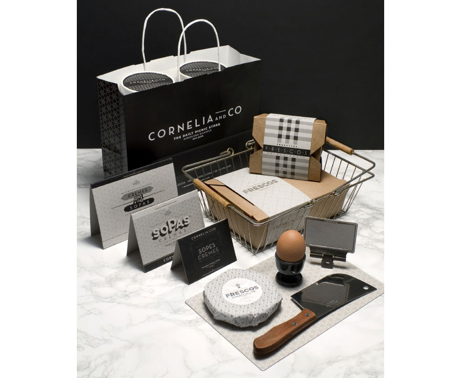


My favourite design to produce has always been on brown paper, I love the effect it gives to a piece of design. I have produced many of my favourite projects on brown paper and regularly used this for backgrounds within my sketch books. I have been trying to experiment with different stocks during my time on the course to increase my versatility but I think brown paper needs to be used within my final project. This promotion and branding for Cornelia and Co is exactly the type of design which I hope to be producing when I graduate. The monochrome colour palette with the stock gives the outcomes a really unique edge and helps it to stand out.


I have to think about interesting ways to display the information about myself and different processes which I hope to develop which I can possibly illustrate and experiment with throughout this module. I do wish that I had used a few more processes throughout the first year but unfortunately I did not. I know that I want to develop my letterpress skills which is something I can easily develop during the last few weeks of the course. I would also like to use the laser cutter which is something I have yet to experience. This branding and design for the space program is really nice. I really like the material they have used and also the different ways of including larger posters within a smaller box.


This promotion for Daniel's bakery is really nice. I love black and white photography as I think it can make any image from the a low quality camera look professional. I use most of my images in black and white as I personally prefer it. I really like how the stock they have used is a bight pure white as with the contrast of the black and white photos adds a really contemporary feel to the design and attracts a wide audience.


The introduction of colour to this design really helps to lift it and become more eye catching. I have recently started to add magenta to black and white design, this is something I think adds a youthful edge to a design as magenta is quite a bold colour to go along with black. I have not yet tried this with brown stock and think it could be very interesting though may need to be cyan instead.


I produced something very similar to this for my A-Level exam. I used Georgina Luck as my main inspiration and really enjoyed playing around with the inks and mixed media approaches to the design. I think this technique is best served within food promotion and therefore might not fit in with the overall aesthetic of my idea and concept. I think the font used within this promotion and think it looks really strong against the powerful colours.


I have recently become so much more aware of my surroundings and the graphic design which exists within every day life. One of my favourite shops, All Saints has an interesting theme of a rustic and over worn exterior, for the brand this works incredibly well and they have managed to create a unique style and identity which is easily recognisable. Perhaps one of the most recognisable aspects of All Saints identity is the old fashioned sewing machine in the windows. I think by including these within their window display entices people into the shop and also fits very well with the aesthetic of the shop. I found this branding for a handmade goods store and it reminded me of All Saints. I would love to include the machine of my trade, a MacBook into my designs in this kind of style as I feel it will be in keeping with rest of my planned outcome.


I like the idea of having a logo watermarked on packaging as I think it can be hard to include a logo within a packaging design. Th watermark effect allows the audience to know the logo of the brand and also keep it in their mind.


The information graphic of this branding and identity is the exact kind of design I hope to produce both within this brief and within my career. I think that infographics are a great way to include large chunks of information in visually creative ways, I also like the illustrations which come with infographics, they are much to my style.


This design for a restaurant is very much to my taste. The letterpress effect on the labels and menu gives the restaurant a personal effect and also makes it seem more organic and thoughtful.


This design shows the difference brown stock can make to a design. The white design is very effective and clear but when added to the brown stock the effect is much more fitting with the overall theme. This is one of the main reasons why I like to use this stock within my work. I feel that the sentiment of the design is much clearer and the meaning behind the design is enforced.


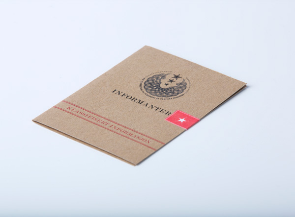


I like the idea of creating an information pack which acts as a folder containing all of the information people might need/want to know about me. This pack looks, to me, very official and a lot like a police file. I like the idea of this but I think it could put some people off as it would seem a bad thing to use to represent me.


When thinking about the size of package I have thought about producing something which is quite large, when researching packaging I came across this design for a wedding. I want to link the package to myself which could constitute a smaller package due to my size. This would mean that I could use my favourite brown paper stock which comes in A4.


I found this package on another of my favourite designers blogs. I decided to add it to my blog not because it is to my personal style and taste but because it gave me the idea to cut into my box rather than to have an acetate window which can be seen through. Instead I would like to use an aspect of my logo, like the design above and cut into my box to showcase the content with something more relevant and personal.


From the same blog I found this other package which I really like. I think the overall design and logics of the box and its compartments are very well constructed and thought out. I love the idea of having a collapsed section where a booklet can be kept, this would be a brilliant place to store my information graphic. I also really like the way there are multiple boxes contained within a package. This could be difficult for me to produce given the timescale I have to produce it.


Leave your comment