Archives

OUGD405 - End of Module Evaluation

1.  What skills have you developed through this module and how effectively do you think you have applied them?

I have developed my skills on software such as Illustrator and InDesign. When we were first introduced the illustrator I felt that it was much harder to use than Photoshop but having created all of my illustrations for the last brief I now feel confident that I can use the pen tool specifically to a satisfactory standard. Other skills I feel I have developed are my research skills. As part of this module has been research based I feel that I now have a better understanding of what research is and how it assists designers in every day life. Team work has also been a major part of this module, I worked in two groups (How To.. and Typogateux) I still feel that group work is very difficult and will try to avoid it if I have the chance but if there was a situation where I needed to work in a group I feel that I can approach the problem and produce a substantial amount of work within the group

2. What approaches to/methods of design production have you developed and how have they informed your design development process?

For this module I have used similar approaches to design production as I have since I started on the course though I feel that I have improved in this area substantially. I feel that I have improved on my skills to ask for feedback from my peers and not just ask my friends. I also feel that my self evaluation skills have improved a lot and that I now am confident enough to approach different medias and forms of design during a brief.

3. What strengths can you identify in your work and how have/will you capitalise on these?

My strengths in this module have been my software skills. I have improved my understanding of Illustrator and InDesign which I feel very positively about. In order to capitalise on my strengths I will continue to use these programs and hopefully improve.

4. What weaknesses can you identify in your work and how will you address these in the future?

Weaknesses in my work are time management and planning. Though I feel that I have improved on these over module I do think they need more work. 

5. Identify five things that you will do differently next time and what do you expect to gain from doing these?

  • Using different media as my final product (an app)
  • Attend workshops in order to widen the range of work I can produce (Screen Printing)
  • Planning the final product in advance
  • Market research in order to learn whether my product would work if published
  • Experiment with different colours as opposed to black and white.

From doing this I hope to gain a level of professionalism to my work.


OUGD405 - Routine Research : The Impossible

For my research in this brief I looked into clean up routines after natural disasters. During the xmas holidays I went to see the new film, the Impossible, which focuses on the tsunami on boxing day in Thailand. I have never experienced a natural disaster and only knew about it from the news and reading other peoples stories. Though this film was a recreation of the event it showed me in a lot of detail the turmoil that stems from a natural disaster.

As my research theme was routines I paid particular attention to what the local people did to recover from the disaster. In this movie it showed how the people from Thailand and also visitors came together  in order to stay alive. Watching this film gave me a particular insight into how busy the hospitals were and what kind of system they had in place to keep track of patients. I also saw how easily families were split up and children lost their parents. All in all this film helped me to gain some understanding of how horrific natural disasters are and how they can tear people apart.


OUGD405 - Research, Collect, Communicate : Product

For our final crit for this brief we were assessed solely by Simon and Amber. The feedback I got doe my work was mainly positive.


  • Think about different ways to bind my book or maybe change it to a set of cards?
  • The facts are very interesting
  • The stock suits the concept very well
  • Work the typeface into my designs
  • Info-graphic is strong, engaging and memorable
From this feedback I feel quite positive with my work but also that I have some starting points to improve my design.

Next Steps...

For my next steps I plan to create more coffee fact pages and experiment with the possibility of creating a deck of cards instead of a book. As I have never learnt how to bind a book I think this could possibly lower the quality of my work as it would look unprofessional. I would think I could link my booklet more to my craft by including some facts about art and design and how coffee in consumed and used in these industries. 

OUGD405 : Research, Collect , Communicate : Product

As this project is a 3 week brief it is important that we constantly have crits to make sure that we are testing out our ideas on other people. I personally find crits very helpful as I like to get another persons perspective on my idea.

During the crit we were given a chance to present the work we have done so far. As I changed my idea the night before I did not have as much development work as a perhaps should have done. The response to my idea was positive and I was given some good pointers to what I could do to improve my ideas.


  • Think about discounts
One person gave me the idea that I should maybe include discounts within my booklet for popular coffee shops. As I am based in Leeds I could maybe link my booklet specifically to Leeds and make connections with local businesses rather than global chains like Starbucks.

  • The name
Some people asked me about the name of my product, so far I do not have an option for a name but I would like to make it a fun play on words which will identify the aim straight away. Some ideas were to link it to the word 'beans' or 'shops' I will think about this throughout my design process and brainstorm lots of different options.

  • Presentation
There were a few suggestions as to what I could do with the presentation, one idea was to use coffee stained paper or coffee rings. This would add authenticity to my product and make it look more carefree. As my book would be aimed at coffee lovers I would expect they would take it with them when they drink coffee meaning they may get coffee spills on the paper. I want my book to be really interactive and interesting.

  • Inside the book
When I described what I would include in my book I was given the feedback that maybe I had focussed too much on serious factors such as the history behind coffee. A suggestion from the crit was to include a few pages about which type of coffee goes with biscuits. 

  • Interactive option
When describing my ideas I got the idea that it sounded quite boring and not interactive. An idea I was given was to make my booklet as interactive as a children's book. I do not know how to produce something like this but would like to try.

  • Info-graphics
One of the main factors in the brief was to focus on information graphics, the group gave me the suggestion to use shapes of coffee beans, coffee cups etc to form my info-graphics. I like the idea of using a coffee cup for a graph, like a pie chart. I have seen this done before and it worked really well.

  • Language
As I had described quite serious subjects there were some concerns about the type of language I would use. I could have gone down the scientific route or informal conversational language which would appeal to my audience. 

OUGD402 - What is Graphic Design for? : Study Task 4


5 examples of websites/blogs that will help you define:

Information and Way-finding design.

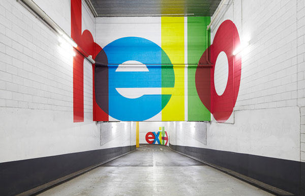
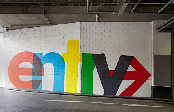
Information and Way-finding design communicates information in interesting and unique ways. Illustrations and graphs are used alot within this area of design. 


...........................................................................................................

Examples... 


This is an example of an information graphic which would be used within a school to teach students about the moon and what happens over the period of a year. The budget, I would think, is quite low as it seems to be very simple and have more text than others which are mainly image based. 


This information graphic has much more defined audience as it is aimed at fans of the Lord of the Rings franchise. The budget would be low as it seems to have been created by a fan of the franchise who has produced this as a personal project. The tone of voice is informal and has a humorous side to it. 


This information graphic is about the presidency elections in America last year. The audience would be any voter within America or someone with an interest in the elections as also American history. The budget would be quite high due to the height of the event. 

japan, debt, crisis, infographic, GOOD, business, news

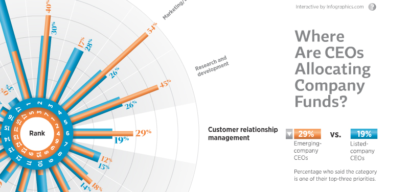
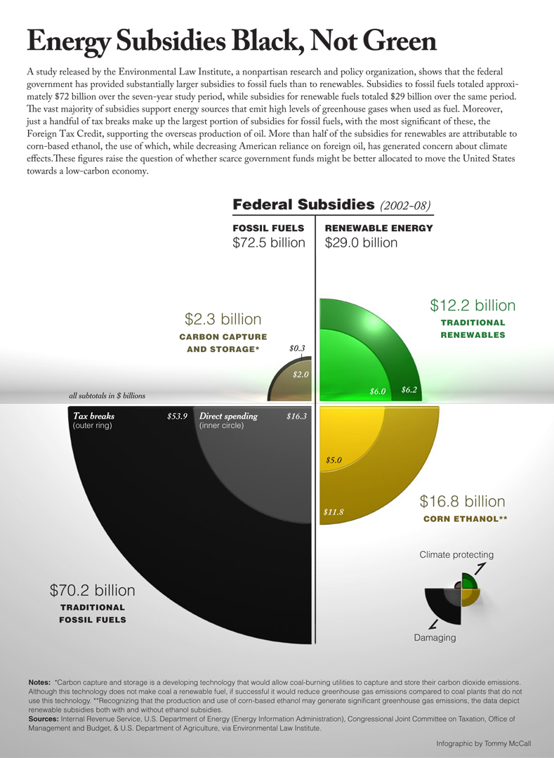
This information graphic is primarily image based, shapes have been used to represent statistics. Given the content of the info graphic I would say that the budget is quite high as it is illustrating quite an important financial topic within the world. The tone of voice within this is very formal as the content warrants it. 


This is an information graphic based on the content of the social networking site, Twitter. Given this the tone of voice can be identified easily. This is quite image based and relates to quite an influential event within America. This would suggest a moderate budget but not a high one.


Blood Pressure: Know Your Numbers infographic


............................................................................................................

Product and Packaging 

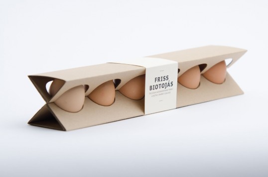
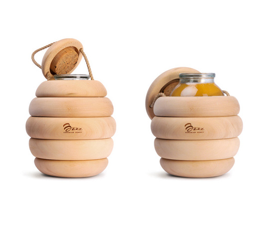
Product and Packaging design can take on many different forms and be delivered in many different tones of voice. The size of packaging depends solely on the size of the product and the audience it is aimed at. 


............................................................................................................

Examples...

antismoke pack


anti-theft lunch bag


nyc spaghetti


Creative Product Designs


Creative Product Designs


.........................................................................................................


Branding and Identity

Branding and Identity is the development of a presence which a person or a group wish to present to the public. This can take on many forms with logos, business cards and other promotional material as the main focus. 


...........................................................................................................

Examples...


.........................................................................................................

Editorial and Publishing

Editorial and publishing is the development of mainly printed material which is bound or presented as a whole object. This can also be screen based and viewed by many people. Publishing can be anything from a blog, website to an actual book which people buy and read. 


http://www.lancepublishing.co.uk/

.........................................................................................................

Examples...

Three front covers of The Face designed by Neville Brody


Retail and Promotion

Retail and promotion is usually in the form of flyers and posters which advertise or promote and event, person or group. Retail design can take on many different forms depending on the theme and overall tone of voice surrounding the brand it is promoting. 


Copyright 2010. All rights reserved.

RSS Feed. This blog is proudly powered by Blogger and uses Modern Clix, a theme by Rodrigo Galindez. Modern Clix blogger template by Introblogger.