The Brief
When first reading this brief I was not fully sure what I would do with it and how to promote myself in a way which was professional and in a way which I find aesthetically pleasing. I have always found it difficult to design for myself and promote myself as I don't want to come off as arrogant or put myself down. I think that for this brief I will have to research heavily into the areas of design I am interested in whilst also producing design sheets and mind maps of my ideas.
Design sheets..
Initial Brainstorming ideas.
Initial ideas for the pack ranged from complex and complicated boxes and bags to simplistic folders and boxes. On reflection of these ideas I think that the simplistic ideas are best suited to me as I work in that way and prefer design at this level.
Logo development and design.
I liked the idea of incorporating my initials into my logo and felt it was the best way to portray myself. These designs varied quite a lot and none of them particularly stood out to me as a definite logo. I think that personal promotion and branding is extremely important and if a designer does not represent themselves properly it can have a massive effect on their professional image and career. Looking back over my designs I think it warrants much more time and thought, which is something I do not have the luxury of at this moment. I want to thoroughly experiment with my logo design until I am sure that I have made the right one for myself.
General Idea Development
The final ideas I have coming to end of my ideas stage. I have come up with the option of creating a folder which has all of my information inside, I like this idea and think it would link more to my personality as I would say that if I were to be represented within this way a folder would be most appropriate, I prefer to use folders rather than a box as I find it easier to find all of my information rather than rummaging through a box.
On the other hand, it would seem some what easier to use a box to hold all of my information, I think that if I were to send out this pack to clients I would think that this would be a more efficient way to display my information. I think if a client were to receive this pack they would think it was more professional and personal on my account.
The Design Process
For this brief I have decided that information graphics should definitely be my main focus as it encompasses me very well. With this in mind I started designing some really simple info-graphics and illustrations which firstly represented my hobbies and what I like to do in my spare time.
I came up with a few ideas but decided that I would produce illustrations for the following;
- Films
- Blogging
- Socialising
- Food
- Music
I feel that these five aspects best describe me though I do enjoy other activities and have other hobbies. As this is an information pack about myself which would be handed out to professionals I do not want to bombard them with information which they might not necessarily want/need to know. Part of the brief asks us to visually communicate ourselves as an individual and I think it is very important that I portray part of my personality in a literal way as it would not necessarily make sense in more subtle ways if I could not verbally explain it. I personally think that design for this purpose should be quite literal and clear to understand as studios and directors might not understand the details we have gone into to portray and attribute.
The illustrations I produced are very simple black vector images which I drew on illustrator. I prefer to use digital illustrations as I feel it suits my style of work more and communicates part of my personality and personal appearance.
Films
Blogging
Socialising
Food
Music
I am very pleased with my illustrations so far and think they communicate the right thing. To be sure of this I conducted some primary research and asked some of my peers to identify the word which goes with the illustrations. The results were :
- Film
- Laptop
- Positivity
-Eating/Cooking
- Music/Technology
These words are not far off the actual meanings and do not necessarily need to be changed to mean the correct thing.
As an experiment I put together a quick mock up of an info-graphic card. I like the look of it and it fits in with my style of design. I am still deciding whether I want to create a large information graphic or something different. At this point I felt it was ok to simply design a quick prototype card which would be enlarged with more information added to it.
Moving on from this smaller information graphic I went on the design a one which included lots more information about me as a designer. I wanted to include somewhere within my presentation my software skills and the areas of design I am most interested in. I wanted to do this in the same style of the previous info graphic and so used the same vector image illustrations and created this larger infographic.
I took inspiration from many of the other info graphics I had found during my research, I used circles and vector images to illustrate my areas of interest and software skills. I am particularly proud of this info graphic as it is set out in a way I find visually pleasing and also is clear, simple and easy to read. I have used info graphics throughout the year and particularly enjoy working with them.
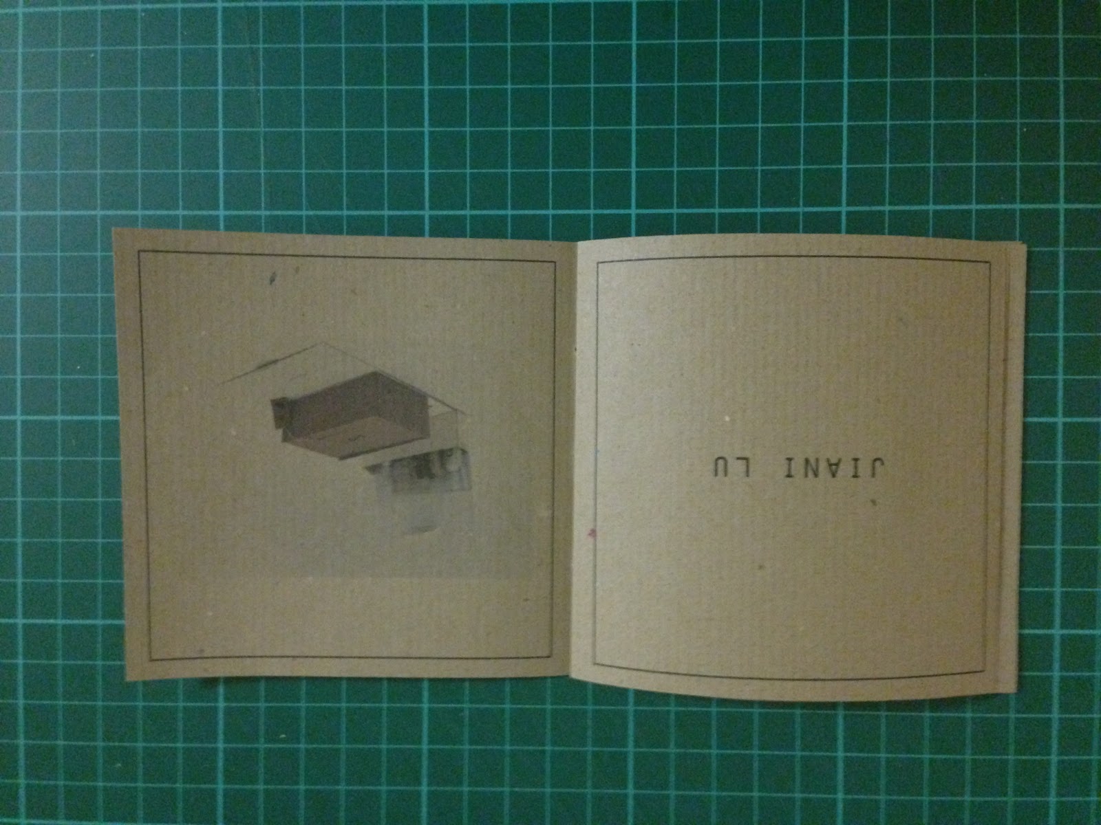
Inspiration Book
I decided I wanted to create a book of inspiration which would contain my favourite designers and studios I have found this year. I wanted to keep the design very simple and black and white as I intend on printing on brown stock.
This is the first design of the booklet. I wanted to keep the information to a minimum so I decided just to display the name of the designer/studio and hope that this would entice people to look at their websites and blogs and discover them for themselves. I also think that clients do not really want to know about my favourite designers in lots of detail.
When printing my booklet I found the detail was affected and some of the pages didn't work well as a book, I decided to alter some of the images and also the pagination of the booklet. These changes I think helped a lot.
Final printed book..
Attribute cards...
For my final aspect to my pack I wanted to display my attributes as a person. In order to do this I came up with a list of my attributes and also asked some of my friends their thoughts. The list I was left with was :
- Committed
- Outgoing
- Honest
- Reliable
- Positivity
- Enthusiastic
- Motivated
- Polite
- Decisive
I was very pleased with this list and wanted to find a way to represent these attributes with a vector image. I found this very hard to do but in the end I overcame the problem and I am very pleased with the final outcomes


.jpg)