Archives

OUGD403 - Module Evaluation


What skills have you developed through this module and how effectively do you think you have applied them?

- Throughout this module I have developed my skills on Adobe Illustrator. Though I have only learnt the basic skills with the pen tool I have found it a really helpful skill to have.  I have also developed my understanding of type and letterform. I came onto the course with no knowledge of typefaces and I feel that this module has helped me significantly to understand an important part of Graphic Design.

What approaches to/methods of design production have you developed and how have they informed your design development process?

- I have further developed my developmental stage of design, I now sketch out a range of different ideas before experimenting digitally. I have found this very helpful as it is a more visual way of documenting my ideas and thought processes. I have also found that asking other people if they understand my message as I am developing my ideas, this is very helpful as it is of the upmost importance that my designs are legible and understandable.


What Strengths can you identify in your work and how have/will you capitalise on these?

- I feel that my strengths lie within the development stages and the ability to self evaluate my work. I now produce a wide range of possible design rather than producing my first idea. I also feel that I am devoted to the course and put a lot of time into making sure that my work is at degree standard.

What weaknesses can you identify in your work and how will you address these in the future?

- I think my weaknesses still lie in software skills. I know how to use Adobe Photoshop quite well but my Illustrator skills could be improved. I also feel that by developing my software skills my work an prints will be at a higher standard.

Identify five things that you will do differently next time and what do you expect to gain from doing these?

- Pay more attention to stock choice and print methods. From doing this I think my work will look more professional and the colours will look how they were intended.

- When producing work to a specific scale (2:1) I will produce my developmental drawings in that format. This will mean that the process of digitally producing my designs will be less complicated as I have already taken the size of the paper into account.

- Use Illustrator when producing anything image based. This would mean that when printed images would not be pixelated and would be crisp.

- Take into account other methods of displaying my designs instead of just print format (designing an app) This will help me to develop my understanding of other technologies.

- Experiment more with type and develop my understanding of type anatomy.


Message and Delivery : Distribution Crit

For our final crit for Message and Delivery we had to critique 6 pieces of work in a pair. Afterwards we were given back our work from another group.


My Crit Feedback 1


This pair had some very good points about my work. They noticed that the stock I used to produce my work on was not thick enough and the mailshot could be seen from the outside. I have documented my print problems in my Design Practice blog and intend to change my stock to make sure that my design looks more professional. Another bit of feedback I got from this pair was that I had used 3 colours instead of the two allowed. I made sure that when I produced that aspect of my design that I used a tone of black which was allowed in the brief. My intention was to have my design be of high impact and therefore I limited the amount of research that I would present in my mailshot. This obviously hasn't worked completely as the pair were confused about some of information I had chosen to display. I will have to revise this before submission. The suggestions that I received from this pair was very helpful and I will make sure to act on it. 


The second set of feedback that I received had similar comments. This is obviously a reflection of my work. I will need to change the stock I used to produce my work and will maybe have to add more information. I do not want to have my design doubled sided as I want it to be simple and to the point. I do not think that people will take the time to read a lot of information especially students. Another comment I received was that my envelope seemed rushed. I was going for a minimal look but will be happy to add more detail to my design to make it look like I have put more thought into it. I agree with most of the comments I received and will make the necessary adjustments before submission.


What is Graphic Design for? Part 2

Editorial and publishing 

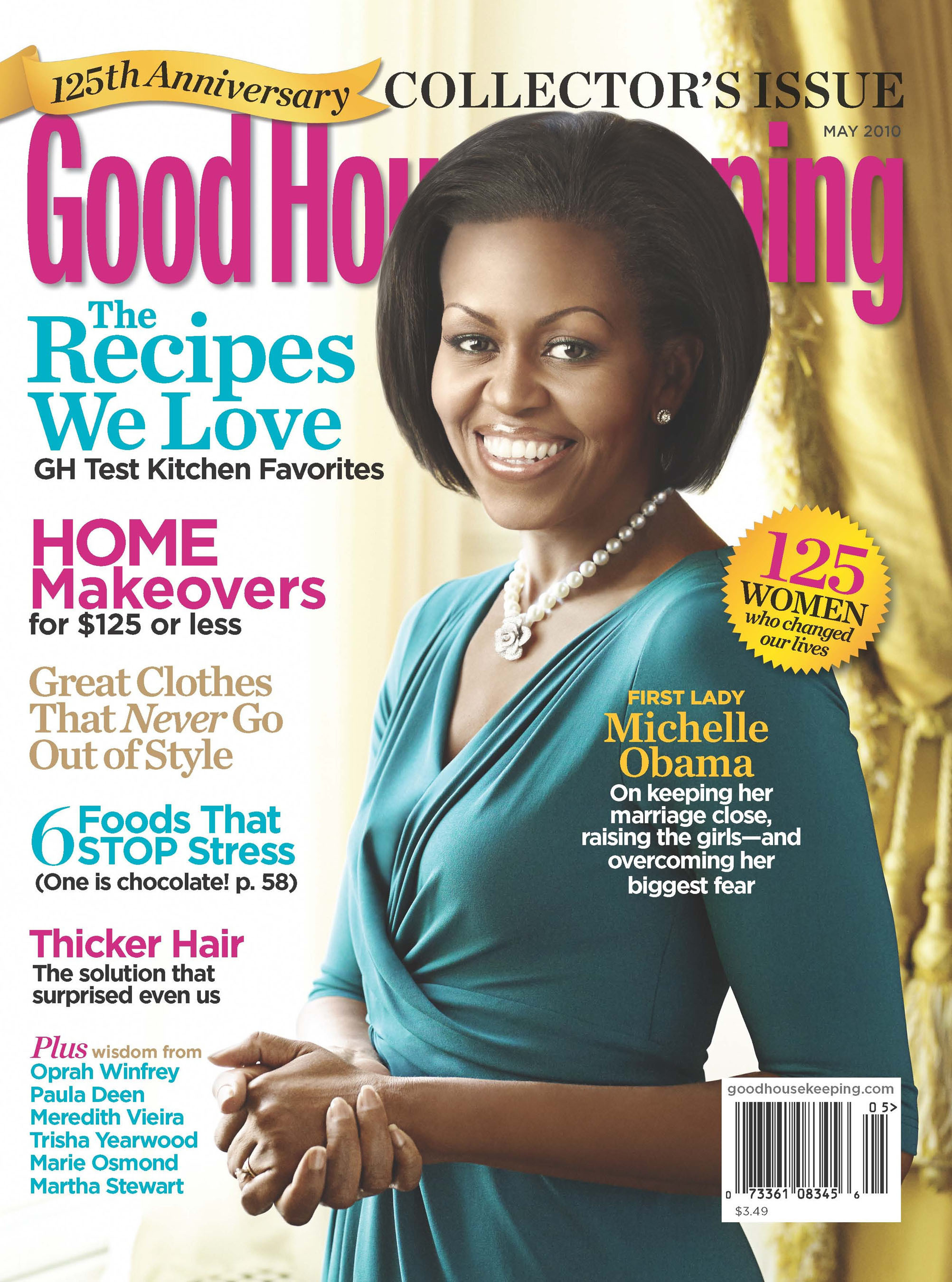
Magazine design

Fashion
Music
Lifestyle
Health and beauty
Current Affairs
Photography
Technology
The Arts
Hobbyist
Food and Cooking
The Home


Publishing

Fiction
Non-Fiction
Travel
Biographies
Manuals
Children's Books
Education
Training
Reference
Language


General Publication

Annual Reports
Catalogue (Commercial, event)
Brochures
Instructional
Public Sector
Self-Publication
Creative Press
Fanzines


Retail and Promotion

Tags
Bags
Signage


Product and Packaging

T-shirts
Calendars
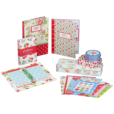
Paper Product (cards, wrapping paper)
Stationary
Wallpaper
Packaging

Packaging as protection


Message and Delivery : 3 Posters Crit


The general feedback I got from the crit was positive. People understood the message I was trying to convey but they did have some trouble with my just image piece. I found this crit very helpful but I think I prefer verbal feedback. 


OUGD402 : What is Graphic Design for? Part 1

Information and Way Finding
Publishing and Editorial Design
Branding and Identity
Product and Packaging
Retail and Promotion

How to categories :

  • Genres
  • Content
  • Audiences
  • Sectors
  • Functions
  • Format
Information and Way Finding


Visual categorisation of data
Research driven


Branding and Identity

Relationship between my work and the industry but also between the two.

Brand - Perceived emotional corporate image as a whole
Identity - Visual aspects that form part of the brand
Logo - Identifies the business in its simplest form


Copyright 2010. All rights reserved.

RSS Feed. This blog is proudly powered by Blogger and uses Modern Clix, a theme by Rodrigo Galindez. Modern Clix blogger template by Introblogger.