Crit 19/10/12
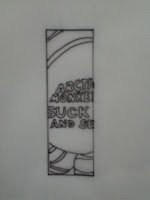
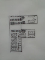
For our crit we had to present our work to a group of people including our partners. in this session we also had to present our partners with a name tag made of our typeface. This was to see how our typeface looked on a smaller scale. My name tag looked ok but I don't think my typeface work as well in a smaller scale. One weakness in my typeface is the amount of detail which I have included, it is not clear and easy to read from a distance though the letterforms are still legible. Simon recommended that I blow one of my letters up large and see what it looks like on a larger scale. I think this could be really interesting though I am not sure which letterform is my favourite and would work on a larger scale. I think if I was to do this task again I would take more care in choosing the gig tickets as some of my letterforms look empty (c and l) as when I traced them I did not include the photography in the background of the letterform.


Leave your comment