I presented my thumbnail ideas alongside my final outcomes as I had not specifically drawn out any of my final ideas.


Feedback from the people on my group was generally positive. They liked the concept behind my design and also how I linked them to the artist. Some of the changes they suggested were:
- Experiment with pastel colours on the background as Jessie Ware wears a lot of pastel colours.
- Try thinner stroke size and a border
After looking at all of my designs they chose one which they favoured the most.
This design was the one which people felt was the most effective as it acts as many different images within an image. One person said that it looked like a love heart, then when turned upside down it looked like spot lights. Also, it features one of Jessie Ware's earrings and is duplicated to link to the lyrics of the song.
This is also one of my favourite designs as I love the simplicity of it. I am going to experiment with the stroke size and background colours before I submit.
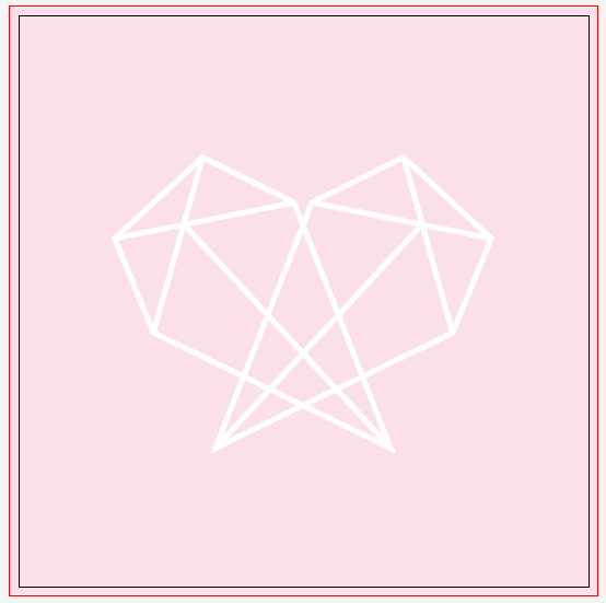
I started out by trying a pastel pink colour which Jessie wore in her 100% video. I think it works really well but the white images are harder to see than I wished.

I tried it in a darker version of the pink I used on the background by adjusting the amount of magenta within the line. I do not like this design as I think it makes the image look tacky and unprofessional.

Trying this design with black lines increases the impact of the shape which I wanted. Although, I do think the black is maybe too harsh on the pink background.

I decreased the stroke weight which has given my design a softer edge which does link to Jessie Ware but I do prefer thicker lines as I think it gives more impact.

I added a border to my design which I am not pleased with as I think it detracts from the actual design in the centre of the page.
Experimenting with more colours


After Experimenting with different colours and weights I have decided to keep my design as it was as I think it is the strongest out of the few.


Leave your comment