5 examples of websites/blogs that will help you define:
Information and Way-finding design.
Information and Way-finding design communicates information in interesting and unique ways. Illustrations and graphs are used alot within this area of design.
Information and Way-finding design communicates information in interesting and unique ways. Illustrations and graphs are used alot within this area of design.
...........................................................................................................
Examples...

This is an example of an information graphic which would be used within a school to teach students about the moon and what happens over the period of a year. The budget, I would think, is quite low as it seems to be very simple and have more text than others which are mainly image based.

This information graphic has much more defined audience as it is aimed at fans of the Lord of the Rings franchise. The budget would be low as it seems to have been created by a fan of the franchise who has produced this as a personal project. The tone of voice is informal and has a humorous side to it.

This information graphic is about the presidency elections in America last year. The audience would be any voter within America or someone with an interest in the elections as also American history. The budget would be quite high due to the height of the event.

This information graphic is primarily image based, shapes have been used to represent statistics. Given the content of the info graphic I would say that the budget is quite high as it is illustrating quite an important financial topic within the world. The tone of voice within this is very formal as the content warrants it.

This is an information graphic based on the content of the social networking site, Twitter. Given this the tone of voice can be identified easily. This is quite image based and relates to quite an influential event within America. This would suggest a moderate budget but not a high one.


............................................................................................................
Product and Packaging
Product and Packaging design can take on many different forms and be delivered in many different tones of voice. The size of packaging depends solely on the size of the product and the audience it is aimed at.
............................................................................................................
Examples...


.........................................................................................................
Branding and Identity
Branding and Identity is the development of a presence which a person or a group wish to present to the public. This can take on many forms with logos, business cards and other promotional material as the main focus.
Branding and Identity is the development of a presence which a person or a group wish to present to the public. This can take on many forms with logos, business cards and other promotional material as the main focus.
...........................................................................................................
Examples...


.........................................................................................................
Editorial and Publishing
Editorial and publishing is the development of mainly printed material which is bound or presented as a whole object. This can also be screen based and viewed by many people. Publishing can be anything from a blog, website to an actual book which people buy and read.
Editorial and publishing is the development of mainly printed material which is bound or presented as a whole object. This can also be screen based and viewed by many people. Publishing can be anything from a blog, website to an actual book which people buy and read.
http://www.lancepublishing.co.uk/
.........................................................................................................
Examples...

.........................................................................................................
Examples...
Source : Design Council

Source : Design Council


Source : Fuel Design


.........................................................................................................
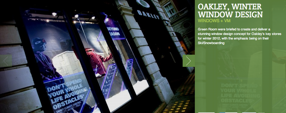
Retail and Promotion
Retail and promotion is usually in the form of flyers and posters which advertise or promote and event, person or group. Retail design can take on many different forms depending on the theme and overall tone of voice surrounding the brand it is promoting.
Retail and promotion is usually in the form of flyers and posters which advertise or promote and event, person or group. Retail design can take on many different forms depending on the theme and overall tone of voice surrounding the brand it is promoting.
http://www.youthedesigner.com/2011/09/03/38-terrific-clothing-tags-for-design-inspiration/
.........................................................................................................
Examples...


.........................................................................................................
Examples...


